Greg Koerner

My uncle suffered a serious heart attack today. As of this entry he is unconscious in the hospital. The doctors do not know if he will awaken or if upon awaking if he will be normal. I can not believe this has happened and am in total shock. He means a lot to our family and is one of my heroes. Please get better Pooh Bear.

Do No Evil Google Earth

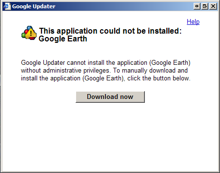
So the recent 4.3 update to Google Earth brings some neat new features. But it also brings some not so great features. Most noticably is the fact that you must be an admin in order to install the latest version of GE. Old versions installed cleanly for any user. Not only must you be an admin, but you don’t actually install Google Earth from it’s own installer. No, now you must install Google Updater* in order to install GE.

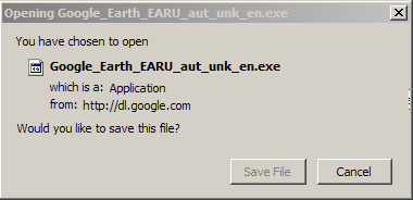
I can’t find a simple link (one hosted by Google) to download just the GE installer. In fact the only way I found to get the GE only download is to be a non-admin user. The Google Updater will fail when you try to run it, and then give you the option to ‘download and install’ GE.

This is quite annoying and I hope that Google provides a simple like to download a stand-alone version of GE soon.

*Another pain is the fact that Google Updater installs a background service that runs all the time. iTunes, Adobe Reader, Google Updater, etc all have these little daemons running that added up bog down system resources. Bleah.

**Special thanks to Tim Snyder for pointing out the Google Updater background service. I didn’t notice that on the first draft of this article.

Life on the Road

My friend Joe is a truck driver. He’s my age (only a week older than I am, but always reminding me of this fact), single, and loving his job. A few months ago I gave him an old digital camera and told him to take some pictures while on the road. Here’s the first batch he sent me.*

“I woke up to my alarm and threw back the curtain between the cab and my bed. It was still dark out! I checked my alarm clock and took another look. I had been snowed in!”

He tells me this is a fairly common way to empty a trailer full of raw materials, like coal. Just pick it up and dump it!

While I would never be brave enough, it would be totally cool to be in the cab of the semi during something like this.

And last he sends me a photo of some mountains in Tennessee. I look out my window at work and see a dull static city skyline. His is aways changing and new.

*From a truck stop where wireless is accessible from your truck. No need to leave!†

†Except for the bathroom, of course.

Next time I’ll have to retell the story about the mating rituals of the common Lot Lizard…Until then, stay safe Joe and keep sending me photos!

Not Home Again

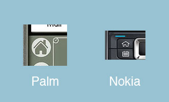
An often overlooked design choice for mobile platforms is the Home button. Usually this button will instantly return you to the main OS screen for most major PDAs and smart phones. For as long as I can remember the most often used icon was that of a house.
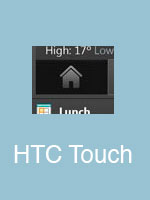
And while the HTC Touch forgoes the Home icon on the ‘main menu’ button it does include it in the OS itself.

(update!) My good friend Josh tells me that the HTC Touch’s physical button is not a home button. It’s actually a big honkin’ Enter button. As in Select/Accept/Return. Wow. Even worse that I thought.
As you can see, even very recent devices use this house as a home icon approach. I understand where the designers are coming from. Humans are comfortable with their homes being the space that is their physical center. But it doesn’t make any sense from a UI perspective. (Or in the modern world where home takes on so many different shapes and sizes, not to mention the increased time we spend away from home, but I digress.) Home is where you launch everything from? Home is escape from this program?

Now let’s take a look at what Apple has done with the iPhone and it’s little brother the iPod Touch.
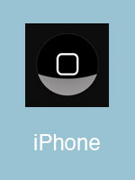
The icon used to return to the main OS screen. (Call it the desktop, springboard, etc) What does it represent? At first glance it’s just a trendy rounded-cornered box. Second glance, it’s a representation of the shape of the device itself. But even that is a bit off, as the device is rectangular and the icon is visibly square.

But wait, what do all the applications look like in the moblie OSX environment?
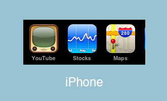
Small rounded-cornered boxes. Just like the main physical button on the device. Simple, clear iconography.