Small Type in a Big Game

Fire Emblem: Three Houses suffers from accessibility hindsight

If you’re reading this on a desktop computer, this image is roughly the size of the Switch screen. Hold your Switch up to compare.

The wild success of the Nintendo Switch has led Nintendo, along with numerous third-party studios, to practically trip over themselves in order to publish their franchises on the successful platform. For Nintendo the latest is the 15th installment in the long running strategy-RPG series, Fire Emblem. The latest game, Fire Emblem: Three Houses, was recently released and has been a critical and commercial success. This genre of game is very text heavy with just the dialog between characters matching or exceeding the word count of most novels.

As a fan of the series, and someone who has worn corrective glasses since elementary school, and an advocate for others I wanted to take a look at a particularly dim1 design choice in the latest game.

The fonts are tiny and faint.

The typographic choices in this game are irritating at best – for someone with good-to-slightly-below-average vision – to abruptly exclusionary to those with stronger vision impairment. I want to take this opportunity to critique the design choices. We’ll discuss how we can determine if this is problematic, examples of the issue taken from the game, suggestions for improvements, and a look into how this could be fixed while admitting difficulties. Most importantly I want to make a persuasive “Why?” as to spur the developers of this game – and any others reading – to actively improve accessibility in their games.

So please, set down the excellent Hogwarts simulator/Persona 5 cross-over for a minute, rub your eyes, squint a little, and settle in.

How to measure “too small”

First, let’s learn a little about what a typical person can see at 20/20 vision.

This is a Snellen eye chart.

The way it works is that an ophthalmologist (eye doctor) places you 20 feet from the chart and has you read the lines until you are no longer able to distinguish the text clearly. The last line you’re able to read to a good degree is what your vision is scored at.

The eighth row down with the red line is what should be legible for folks at that distance with 20/20 sight.

According to the American Academy of Ophthalmology, “A person with 20/20 vision can see what an average person can see on an eye chart when they are standing 20 feet away.”

Dr. McKinney, an ophthalmologist and glaucoma specialist at Eye Health Northwest in Oregon City, Oregon also claims, “that only about 35 percent of all adults have 20/20 vision without glasses, contact lenses or corrective surgery. With corrective measures, approximately 75 percent of adults have 20/20 vision”

So most people don’t have 20/20 vision. According to research from the National Eye Institute, “More than 33 percent were nearsighted and 36 percent had astigmatism, which causes fuzzy vision, the team reported. Another 3.6 percent were farsighted, meaning they can see at a distance but not up close.” 2

With assistance about 75% of adults can have 20/20 equivalent eyesight. That leaves out one in every four persons. This is assuming perfect math and statistical accountability. Those are large numbers of people who are impacted by poor accessibility design.

If you have poor vision or lost your glasses, your visual acuity would be worse. Let’s say it was something like 20/100. This means that the smallest line on the eye chart that you can read at 20 feet can be read by someone with perfect vision who is standing 100 feet away.

The E on the Snellen chart is about 3.5 inches tall. That makes the line of text demarcated at 20/20 appear at about .38 inches tall. Roughly equivalent to a font size of 42px – viewed at 20 feet.

Now let’s talk about what is accessible at the size and distance of typical electronic device usage, with an obvious focus on the Nintendo Switch.

Accessibility recommendations

From the Game accessibility guidelines, a set of guidelines created by a group of developers, specialists, and academics in 2012 states:

“Use an easily readable default font size”

“Small text size is a very common complaint amongst people with vision impairments, whether medical (such as long sightedness) or situational (such as small mobile screen, or a living room that does not physically allow for a large TV close to a couch).”

What are their recommendations? They quote the Amazon Fire TV UI guidelines.

“Amazon TV have 10-foot-UI guidelines that include text size recommendations, of 28px minimum when viewed on a 1080p screen. When viewed on an average size screen this tallies for what would be expected for someone with 20/20 vision while using the Snellen Chart. However because it does not take any degree of vision impairment into account, use 28px as a minimum rather than a target, aim to exceed it wherever possible.”

That last bit is most important.

“use 28px as a minimum rather than a target, aim to exceed it wherever possible.”

Most of this essay will focus on the frustration with Fire Emblem’s type choices in handheld mode. This is where the issue is most egregious and the easiest for me to simulate with screenshots. However, let’s talk for a second about what 20/20 means for someone sitting in front of a television.

According to Amazon’s guidance the minimum target is 28 pixels at 10 feet. That’s pretty close to half the size of 42 pixels at 20 feet. Close to what we’d judge “perfect” 20/20 vision at with the Snellen chart. So, while I’m using back-of-the-napkin math, this issue is not unique to handheld mode, and would benefit players using larger screens.

Microsoft, makers of the Xbox series of home consoles, also provides solid guidance around accessibility, including building your game with diverse visual acuity in mind.3

“Can you effectively play the game on a small monitor or TV sitting at a distance?”

https://docs.microsoft.com/en-us/windows/uwp/gaming/accessibility-for-games

This is even well known outside of the video game industry. For web developers 🙋‍♂️ this is best represented in the Web Content Accessibility Guidelines. First published in 2008 (only a few years after the Xbox 360 and PS3 were released) the guidelines cover numerous points in regards to accessibility, including that of the appearance of text.

“Except for captions and images of text, text can be resized without assistive technology up to 200 percent without loss of content or functionality.”

https://www.w3.org/TR/WCAG21/#resize-text

The visual presentation of text and images of text has a contrast ratio of at least 7:1

https://www.w3.org/TR/WCAG21/#contrast-minimum

App developers too have had guidance around the legibility of text in mobile apps. From Apple’s User Interface Guidelines,

“Use text size to help determine contrast. In general, smaller or lighter-weight text needs to have greater contrast to be legible. “

https://developer.apple.com/design/human-interface-guidelines/accessibility/overview/color-and-contrast/

Heck even printers have figured this out decades before LCD screens! According to The Print Handbook, a guide for people who print things, Designer Andy Brown states that if your viewing distance from your text is at 10ft (like say for a poster) your minimum text size should be 25pt. While points to pixels is not perfect, that’s pretty close to the Amazon recommendation of 28px minimum at 10ft. And Andy’s guide is not specifically for accessibility, just a general rule of thumb.

Oh, it can’t be that bad!

Let’s take a look at a few examples from the game.

These are taken directly off the Switch in handheld mode at 720p and are unedited.

As I mentioned earlier, if viewing this critique on a desktop computer, the images should be sized roughy at the same physical size as the screen on a Nintendo Switch. 4

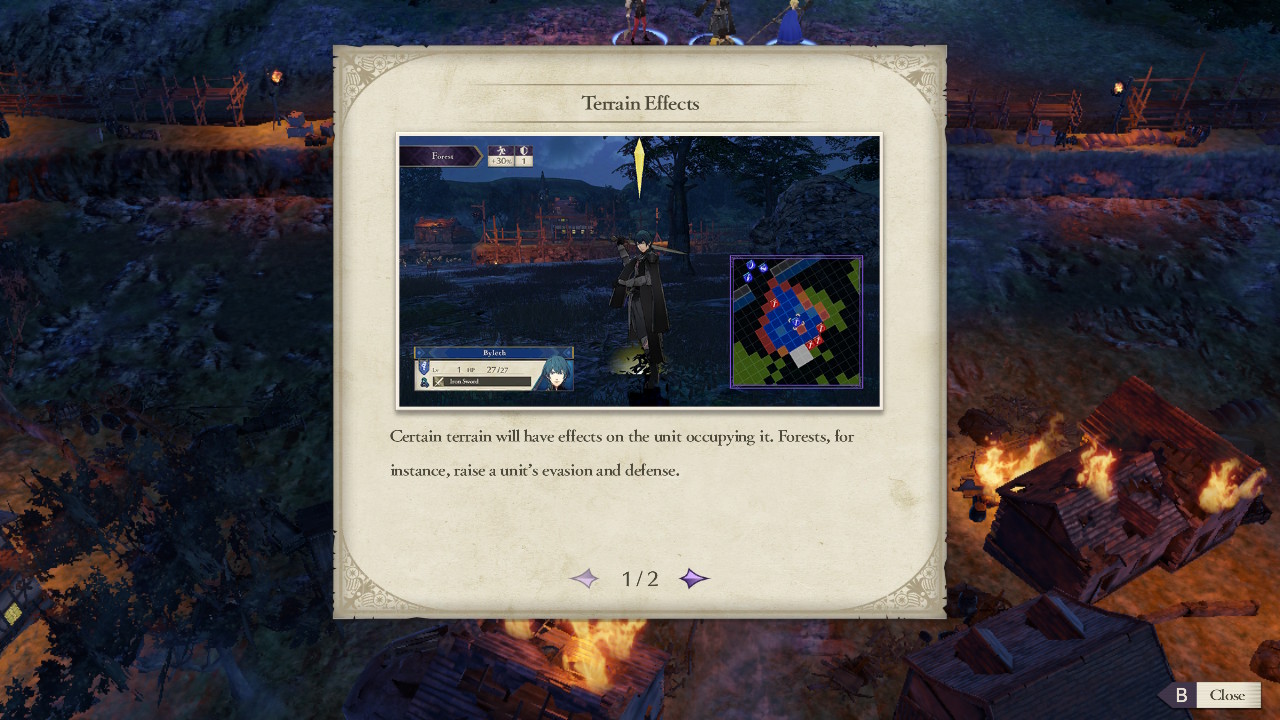
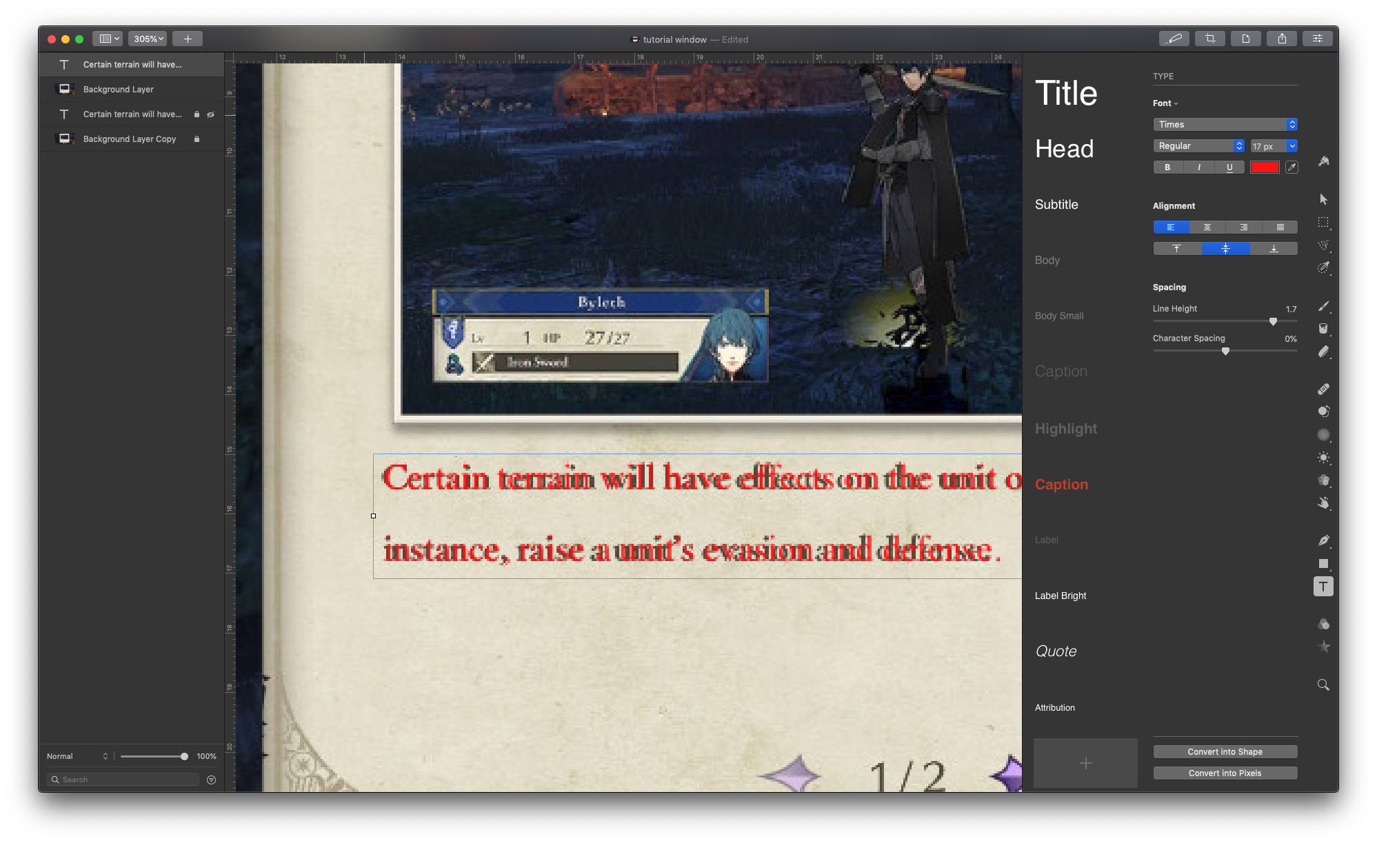
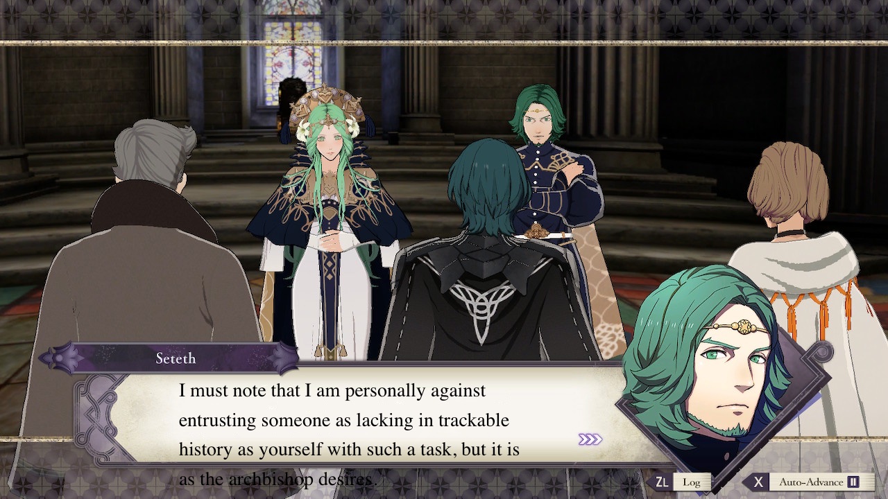
Take a look at the text below the image in this tutorial dialog. 5

That text is rendered in a serif font, probably a variant of Times New Roman, in a size of 17 pixels. How do I know? I brought the screenshot into my image editing tool of choice, Pixelmator Pro, and measured.

Another example.

I’ll be ready to fight as soon as I find my glasses.

This is another screen where the font is 17px.

Now is a good time to mention that serif fonts, like the one predominantly used in Fire Emblem, are worse from an accessibility standpoint. Sans-serif fonts – those without the little strokes at the end of a letter – are generally better for accessibility.6

Another?

17px again.

Ok, and how about some dialog boxes?

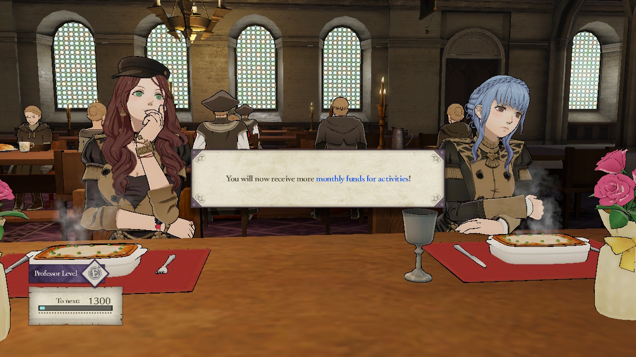
Well, here things improve slightly. The text is 24px in size. That is closer to the minimum recommendation of 28px shared above. The line height is about 1.25x.

Ok, but what about at 1080p. Well, I can’t take a native 1080p screenshot from the Switch. All screenshots (and video) are captured at 720p from the Switch. ಠ_ಠ

Which means that on one hand it’s hard to give examples from that resolution, but on the other hand that resolution is not as easy to portray regardless. When reading this article on the web you’re much more likely to be at a closer distance to your screen, similar to when you play your Switch. A 1080p screenshot would need to be viewed from a similar situation as you would a TV – further away with the image full-size on a larger screen.

Contrasting views

The text is not just too small. Fire Emblem also has an issue with contrast.

The common appearance of text in-game.

The font is not a solid black, but for what I can only assume were design aesthetics – to give the dialog boxes a parchment-like quality – the type is a shade or two lighter brown color. On a light brown background.

That’s a contrast ratio of 5.7:1, well below the 7:1 suggested by WCAG.

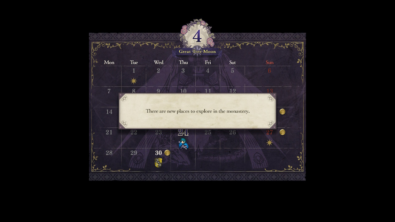
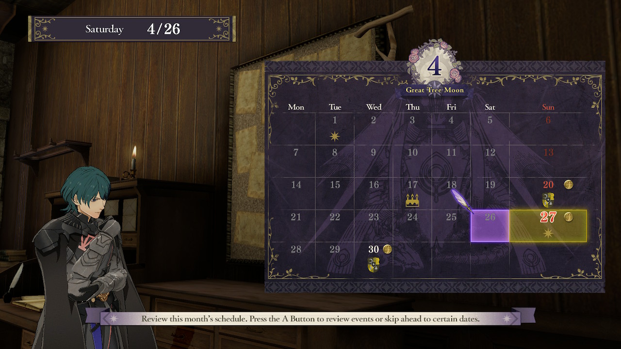
This persists through nearly every dialog in the game: quests overview, dialog boxes, inventory menu, and even the calendar; which is not brown on brown, but light gray on dark purple!

Thankfully it’s just the days of the week that are low contrast. But look at that bottom banner text. 😬

Here’s a really bad (or good‽) example. Can you easily read the blue text in the lower left corner? Try opening this at full size too.

The Fire Emblem Awakening foot gremlin strikes again!

What does better look like?

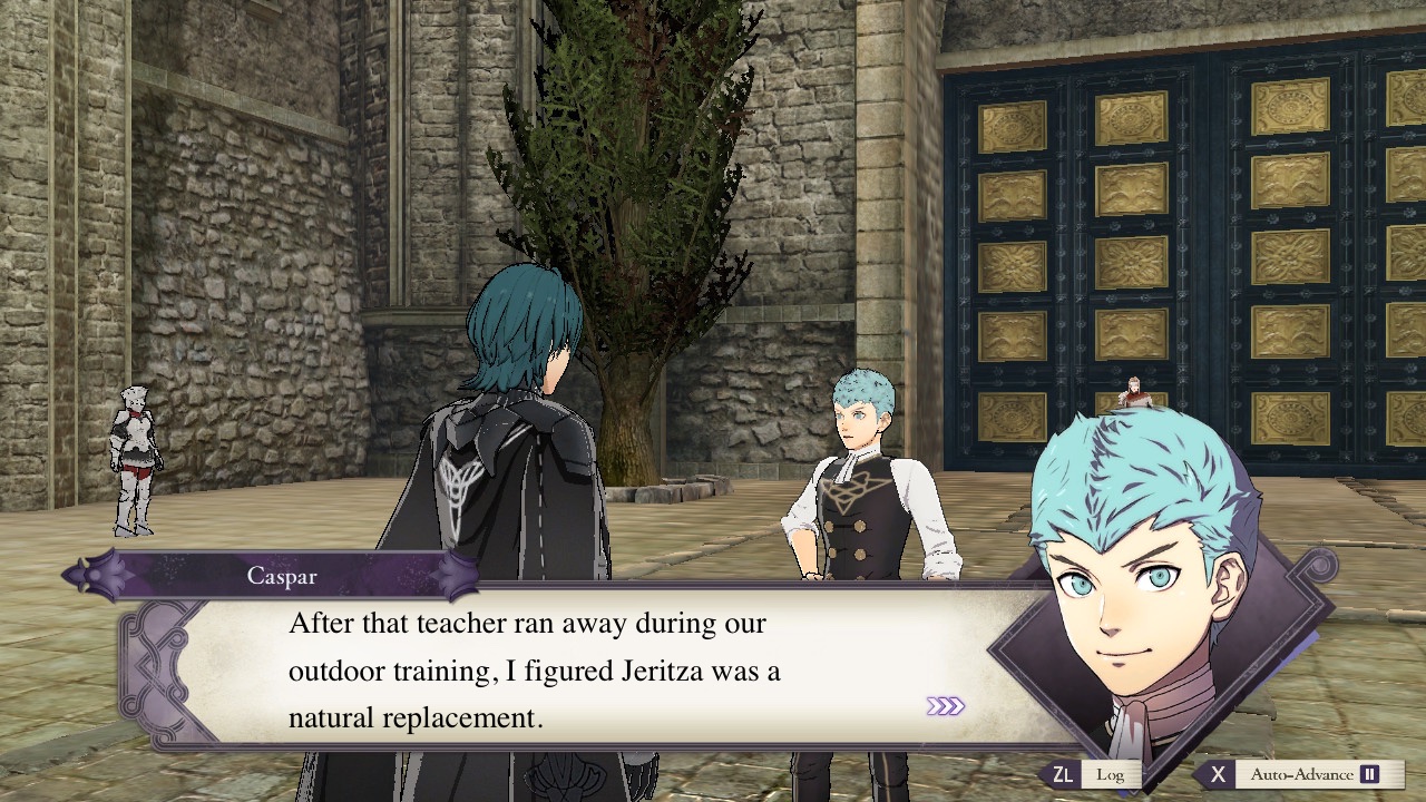
Well, let’s start at the most simple. Increase the contrast.

This is the same dialog mentioned before with Caspar. The only difference is I changed the text color to be a solid black. The font size is the same 24px.

Here’s another.

Here we can see the same improvement.

What if we actually made the font bigger? How much larger could we go? Let’s take another look at the dialog with Caspar.

The font is black and set to 28px – our minimum recommendations from earlier. I’ve kept the text roughly within the same margins as the original dialog and the same line height.

Again, with the other dialog.

overflow: visible;

Whoops! There are some challenges in just increasing font size.

What if we try and fill the space by increasing the font size and using us as much available space? Here’s a mockup at 32px.7

Again with the professors.

Even with expanded margins and line height, the text would need to be modified. Either larger boxes, or splitting up the dialog.

Note: A larger line hight along with better character spacing also helps folks with disabilities like dyslexia; which is not demonstrated in these mock-ups.

What are some solutions?

So it’s easy to arm-chair critique the many years of development a game goes through by a team of professional game designers. It’s a little more difficult to suggest solutions.

So in the spirt of being constructive, here are a few. I’m afraid many of them are in the game developer’s hands.

As a consumer you options are:

  • Deal with it, which is the least helpful and most “there’s not a problem” way to handle this.
  • Use a larger screen and/or sit closer. Affording to buy a new TV to play a video game, much less the space constraints of a larger screen, are out of reach for many folks. This also has apparent downsides according to my mother (and many medical professionals) circa 1990 when I was nine and sat inches from the TV. 8
  • Use the Zoom feature on the Nintendo Switch.9 This is clunky and feels very second-class.
  • Contact Nintendo and politely let them know of the issue. Pray to Sothis that they fix it.

For the developers in the room, a few things to consider:

  • Plan ahead for accessibility early in the development of your game.
  • Hire an accessibility consultant if you don’t have anyone in-house to help. They will identify more problems than just small text – from color issues, audio, interface elements, controls and more. Hire them early and throughout the development process – before you design yourself into a corner.
  • Learn from existing solutions within the video game industry and outside. Ensuring your product-that-appears-on-a-screen has legible text is much closer to solved than you may think!
  • Error on the side of caution – bigger text means a more inclusive game without sacrificing the enjoyment of anyone.
  • Make game-wide text adjustable if possible – some folks can’t see small text. Some like it big. Some prefer higher information density. Some folks have cybernetically grafted hawk eye implants. This requires more development time and adds complexity, but has a net gain of fewer white guys with opinions 10 writing critical think pieces on their blog and more people being able to enjoy your work.
  • Test in multiple play situations, with people of various backgrounds. Not all people who will be enjoying your game will be doing so in ideal scenarios. Play on public transportation with unpredictable ambient light. Visit a friend’s house with big TV. Visit a friend’s house with a smaller TV. Have your dad play it on his recliner in low light. Let him rest when he falls asleep. He’s tired.
  • Remember that not everyone will have a pair of headphones handy or can turn the volume up (or can even hear!) to listen to the audio. For many people of all kinds, the text is the primary method of understanding and enjoying your work. As you are developing, play the game without sound. Are there any nuance or cues missing without audio? Can you represent them on-screen with text or indicators? Are those visual cues legible‽
  • Developers often work in a well-lit office space in front of a nice 27+ inch high density monitor. Not everyone playing will be doing so in front of a 60+ inch HDTV on a couch perfectly situated like an IKEA display room. Life is full of variance and the Nintendo Switch is designed to be enjoyed within such variance.

“So Nintendo just needs to make the text bigger?” Well, no. There is difficulty in this work; undoubtedly so when not considering this from the onset and having to react after a game has been published.

As pointed out, some text boxes are quite full even with the current, too-small, text. These assets would need to be changed and there are many different kind of boxes containing text across the game.

Breaking up these text boxes is not as easy as just setting a font size and margin. As the voice acting is tied to the text visible on screen, timing of the spoken dialog would need to be changed to match. That would require some very specific edits to the existing recordings at minimum, and may even entail re-recording lines (especially if there’s not a natural break in the spoken words as it matches the text on-screen).

At minimum, the developers could revisit the font used and increase the contrast. They could perhaps better fill existing text boxes that currently have room. Ideally they would increase the size as much as possible, mostly in menus and dialog boxes. Ideally, all of this and learn from this shortsightedness in preparation for their next game.

With so many games originating in languages other than English, and so many being localized into other languages, developers should establish a flexible system for displaying text in their game early in development. This will not only approve accessibility in relation to visual acuity as we’ve discussed, but accessibility in culture and context! Making it so you can accommodate multiple scripts and directions is easier to do along side considerations for accessibly. 11 12

Et Conclusion

I set out to create a fair and constructive critique of a problem that is not unique to Fire Emblem: Three Houses 13 and I hope I have done so. If you found this useful, please share. If you have suggestions, please leave a comment. If you want action, please contact Nintendo and your favorite game studio.

See also

Star Simpson – XOXO

Star Simpson builds hardware with soul, currently working on sky machines at Otherlab. The creator of the PLIBMTTBHGATY series of coding events and the TacoCopter drone delivery concept, Star’s latest project is Circuit Classics, reviving the hand-drawn circuits of Forrest M. Mims III as hardware kits.

If you’ve ever done something creative 1 you’ll know the alternating feelings of “This is crazy”, “This is terrible!”, and “This is great!”. I enjoyed Star Simpson’s talk on how that craziness is what often leads to some of the best things people have ever made.

I’ve languished in sharing more videos from XOXO, but this one is rather timely. Just the other day I learned that the circuit board designs Star talks about are now available over at Adafruit!

As Those Who Make

It’s not, of course, that there’s anything wrong with making (although it’s not all that clear that the world needs more stuff). The problem is the idea that the alternative to making is usually not doing nothing—it’s almost always doing things for and with other people, from the barista to the Facebook community moderator to the social worker to the surgeon. Describing oneself as a maker—regardless of what one actually or mostly does—is a way of accruing to oneself the gendered, capitalist benefits of being a person who makes products.

– Why I am Not a Maker – Debbie Chachra

I make communities. I do it with other people. It is just as valuable as those who make the architecture, content, documentation, and software that these communities use and support.

Notes from the first Enterprise MediaWiki Conference

On May 22 – 25 I attended the first Enterprise MediaWiki Conference (EMWCon) in New York City. It’s a continuation of the similarly named SMWCon, but with a strong emphasis on all flavors of MediaWiki and how it is used in organizations large and small. I was able attend in my capacity as a staff member of the Wikimedia Foundation (WMF), but have had a personal interest in the MediaWiki community for a few years now. I thought it would be helpful to write down a few notes on my experiences and share those with folks within the Wikimedia movement.

At the conference I learned how folks are using MediaWiki, what difficulties they face in their use, and their concerns for the future of the platform. 1

Quick Take Aways

A few large points that struck me as worth mentioning.

  • There are many people using MediaWiki in interesting and unique ways. This is the 4th MediaWiki-focused event I’ve attended in the last two years and at each one I’ve discovered new uses in new industries. This time around? Johnson & Johnson, General Electric, a large banking company, and a large oil company all use MediaWiki in some capacity to help document and share knowledge within their organizations. This is on top of groups like Circ du Soleil, MITRE, NATO, and NASA that I was already aware of. I was also impressed by the half a dozen independent developers who support organizations in using MediaWiki. Some folks have smaller organizations with smaller wikis – which is impressive. It’s even crazier to think that this bit of open-source software can be used inside so many large, well-known, organizations – often to great success.
  • Users of MediaWiki – specifically those that write their own code – want acknowledgment. They want to know that the folks who are pointing MediaWiki toward its future are aware of these diverse use cases and keep that in mind when making decisions that would impact non-WMF-supported use.
  • They also want to know what the WMF’s plans are. They want to be reassured – and to be able to reassure others within their organizations, that MediaWiki will be around. A simple, high-level roadmap would do wonders here. There is a large ask of the foundation to make a decision on what sort of support will be offered – even if the answer is an uncomfortable “nothing” it would be better than the current strain of “Eh, we really don’t know.” At one point during the conference I made the joke that the WMF had ‘cookie licked’ MediaWiki. :p
  • I had one attendee, a long-time MediaWiki admin and community member, ask me, “Am I a volunteer? A contributor?” This is from someone whose organization has no less than 14 extensions on MediaWiki.org and who has contributed code to the core development of MediaWiki. They were not certain if their contributions were as valued given that what they work on has a much larger impact on third-party users than Wikimedia projects. People within the MediaWiki community want equal treatment and respect as developer contributors.
  • Lastly, the WMF should consider the impact this community has had in the development of MediaWiki as a popular and healthy open-source software. There is an incredible financial worth in the patches and extensions contributed by third parties. I mean, to be frank, we have people working at NASA and MITRE (among others) sharing their work with the MediaWiki community. The time and talent alone is something that should be considered a strength within our community.

MWF?

Another topic that has been gaining steam recently in the MediaWiki community is the idea of a “MediaWiki Foundation”. A non-profit organization that focuses on the core development of MediaWiki as an open-source software project – influenced by all parties equally. I think it’s going to happen in some capacity.

Generally speaking the MediaWiki community agrees it won’t be the big, giant, dramatic change like moving all of MediaWiki ownership out of the WMF.

Instead the focus will be on small deliverables. Right now the MediaWiki Stakeholder’s user group is looking for a small task on the wishlist, funding (passing a hat around!) and working to show that something was accomplished. Then, after being able to show their work, approach the WMF with a request for some of their time to discuss how they could work together. If you’re interested in following along, check out the MediaWiki Stakeholders’ wiki and the #mwstake room in the Wikimedia Phabricator.

A Real Community

While some wikis are internal and not public, the folks at the conference freely shared their experiences and knowledge for others to benefit from. One attendee described the community and our relationship with one another in an interesting way. We’re not competing with each other to ‘build the best wiki’ but we are competing together against closed, propriatrty systems of knowledge management that permeate organizations across industries. These systems have an antiquated model of documenting and sharing knowledge that is antithesis to truly sharing information to empower members of the org. For example, SharePoint sets permissions to be closed by default. You have to know the information exists, somewhere in the laybranith of SharePoint sites, before you can request access to it!

I think that this event acknowledges that we come together freely to share across industries and uses. It is endemic of having a natural community – not one forced out of branding, marketing, or sales departments within a for-profit organization.

Wikipedians in our midst

While the conference was focused on MediaWiki use outside of Wikimedia projects, attendees did have an opportunity to get to know more about the Wikimedia world and meet folks who are involved in related projects. One of our hosts, Pharos, is a long-time editor on English Wikipedia, president of the NYC chapter, and was a Wikipedian-in-residence at the Guggenheim Museum.

At the end of the first day the NYC chapter brought pizza and people together to talk about what they had been working on. I met no less than 3 individuals involved in Afrocrowd.org, a Wikipedia project I had never heard of until this event!

I also met a long-time MediaWikian, Frank Taylor, who was interested in the work the WMF was doing around emerging communities. He even offered to put the folks at the foundation working on this outreach in contact with folks he has worked with in Central and South America. Which is a kind and unexpected example of the communities sharing interests!

Conclusion

I encourage folks to attend future EMWCons (and SMWCons). They are a great opportunity to learn and share with one another, to create relationships beyond Talk pages, and to grow an already impressive community. In particular I would like to invite the following groups.

  • WMF staff who work on MediaWiki core development, planning, and developer relations.
  • People who use MediaWiki – or are interested in using a wiki!
  • People who want to encourage open-source software and free knowledge – even when the knowledge is shared not among the entirety of humanity. There is a very real halo effect in people using MediaWiki. The philosophy of the wiki changes organizations approach to sharing and working together. It breeds familiarity with many aspects of the wider Wikimedia movement. I know I’m only a factor of one, but my Wikimedia contributions are born out of the use of MediaWiki within a ‘closed’ organization. 2

See also

Two Months at the Wikimedia Foundation

Today marks the anniversary of the two months I’ve been at the foundation. What a whirlwind. I’m still in the honeymoon phase. I still feel like I’m moving too slow, making too many mistakes. Still don’t know who holds the institutional knowledge. 1 I’m enjoying the work I’m doing and am excited to be here.

A lot has changed, for the positive, in the last few weeks, but we’re not without our struggles. Folks have been leaving, budgets are tight, and there’s still a tension in the air within the relationship between the foundation and the rest of the communities. 2 I do my best and most folks I work with seem to appreciate me being there, so that’s good. 🙂

I have been taking notes, mostly at random, about the role I now embody, culture, and relationships. I thought, here at two months, now might be a good time to share some of them. They’re half-formed and through the lens of a person new to this corner of the world. Take them as you will.

—-

A Few Random Thoughts

I left my stable career in IT (and healthcare, which, while going through the a lot of changes here in the US, is not going anywhere for the foreseeable future) to dedicate my time to improving the community aspect of the movement. I wanted to do more in this community, but was limited by time and energy. I’m now able to dedicate time and make a living. That’s incredible. I’m incredibly grateful to the people who interviewed, and ultimately hired me. I hope that as they look back years from now I keep that decision as “a good one” in their minds.

Ignorance is the biggest challenge our species faces. Education, even if shallow in new areas leads to better individual and group decisions. If you know X you’re more likely to not do Y. Empathy, again is critical to our future.

Individual contributors have motives, beliefs, concerns. These are amplified by the vocal members and can some times be misinterpreted as ‘what the community feels’. It’s hard to balance the voice of a few with the silence of many. Who do you listen to? Who do you trust?

On Writing

Oof, writing for a diverse audience is much harder than I thought. Even little things I would include in my writing, like contractions, throw me for a loop. I plan on writing more on this, but for now a few bullets.

  • Be mindful of gender (“Hey guys!”)
  • People-first language (“a person with disabilities”, not “a disabled person”)
  • Avoid acronyms and abbreviations, even super well-known wiki world ones.
  • Assume nothing
  • Avoid the word ‘user’ 3
    • prefer readers or editors, contributors, volunteers, folks, people
  • Avoid cultural references
    • “Like that guy in that one movie”
  • Use simple English, translate whenever you can
  • Don’t be ethnocentric
  • Be mindful of age and experience levels
  • Use statistics to back up claims that can benefit from data
  • Use stories and examples, from the people you are talking about (not just yourself) to back up claims about experiences and human relationships.
  • Remain positive – even if the news is bad, don’t be dreadful.

Finding people and getting them involved is incredibly challenging. Where can I go to get folks involved? How do I get the feedback the team needs? How do I channel the feedback from many sources to the team? These are still messy to me. I know folks keep saying “it doesn’t scale”, but part of me really wants to just pick up a phone and give someone a call.

Transparency

Be aggressively transparent. It’s hard. Transparency is important to pretty much everyone involved in this crazy endeavor. So is privacy. So is civility. Sometimes the three come together and do not mix well.

I am concerned that issues with a lack of transparency stem from issues of civility and fear. Folks are afraid to share something because last time it was not pleasant to hear the sometimes painful (intentional or not) feedback. So they hold back on sharing until later in the process. Then more anger is released for sharing late, which causes distress, assumptions and mistrust. Which causes folks to be hesitant to share again in the future, which…you see where this is going.

Sometimes transparency is demanded. That’s not cool. It shouldn’t be. It should be something we lead with, not react with.

Bullying

We are peers. No more, no less. Like your peers at school or work, some have more experience and skills in a given area – some have less. Like working with others outside of the wiki world, being a team brings together those strengths and weaknesses to balance one another. All boats rise with the tide.

Be civil. Be hard in the problem and soft on the person. We’re all rowing in the same direction. Let’s see if we can improve our sync and get there faster with less friction.

We, everyone in the movement, should do better to speak up to bullying. This will be the one thing that tears us apart. The beginning of the end will not be marked with a terrible software update, a lack of funding, a poor hire, a want for  contributors.  Not software, not bureaucracy, not money – the root lies within our community to be effervescent in welcoming people and treating long-timers with dignity and camaraderie. The movement has a bad reputation here and no one can fix that with a patch. It’s something we have to get better at. All of us.

There’s a strong correlation with bully=loud, targets=quiet.

I think it’s really terrible that we tolerate terrible behavior within our communities. That we turn a blind eye to those that harass, demean, and otherwise act like jerks to folks within our community – especially those that are traditionally underrepresented. We have a bully problem and instead of addressing it we let it fester. To be clear, I’m not talking about people who insert nonsense edits, revert changes they don’t like, etc, but those that use an unpleasant edge and uncivil tactics to claim victory, demand entitlement, or otherwise ‘get their way’.

We have to stop making light of and ignoring these problems areas. For example,  wikimedia-l is a room in the house we all share. If it’s on fire you don’t ignore it.

It only helps perpetrate the exclusion of those without a voice. If we keep letting it happen we’re complacent with that behavior – toward anyone.

“there are active members of our community that can be unforgiving and unempathetic.”

“not be worried of having others answer with the passion that can sometimes be perceived as being lashed out against”

These are quotes from conversations not about civility, but transparency. There is a close association here though, as I mentioned earlier.

Instead of addressing bad behavior head-on we avoid it, work around it, make excuses, and – up to a point – tolerate it. 4

How much of this power we let jerks have over or emotions and energy drives a lot of the decisions – or decision paralysis – we have to deal with. We lead too many of our decisions with fear and uncertainty, not confidence and prosperity.

It’s a downward spiral of repetition.

We need to fix it.

I know it’s freaking hard. That’s why I joined the WMF, because I want to tackle these big messy issues while they’re still young, while there is still a chance.

Our Code of Conduct needs to be finished and encouraged by as many community members as possible. We need to show overwhelming support from all levels within the foundation – ED, Arbcom, Jimbo, C-level, Liaisons, etc. It needs to be taken seriously and enforced just the same.

We have to turn this ship around when it comes to our communities’ reputation.

We don’t have a ‘comments’ section, but this is close to what we see in comments elsewhere in our lives. It erodes our projects reputation and the incredibly amazing work of everyone involved.  You know when someone mentions a terrible corner of the web and you’re all like “Yuck”? That shouldn’t be the reaction when you tell people you’re a Wikimedian.

On Being Bold

One of the tenants of the movement is the idea to “Be bold”. To make decisions, to jump into the fray, to take action.

What does “Be Bold” mean to those that are underrepresented, marginalized, or otherwise dismissed by large swaths of a society? What does be bold mean to those who are introverted or those who are often sidelined when they are bold?

Some approach (wrongly) a woman being bold as “bossy” while a male counterpart would not.

What is bold for me, a young(ish) white male, is not the same as someone else. Notice the bold in everyone.

Fundraising

I know nearly nothing about how the foundation handles fundraising. It’s a different area, but I am acutely aware of its importance. Helping my wife run the comparatively small pet rescue make it apparent that it’s a constant balancing act.

It costs money to run one of the top 10 sites in the world. Storage and computing power need increase, hiring talented people to support the movement. Funding programs and initiatives to empower contributors and expand the movement

We need help, not just to keep the lights on, but to continuously improve Wikipedia and all Wikimedia projects. In the span of human history there has never been such a place where so many can come, freely, to learn and help others.

We also have to be fiscally prudent and make sure Wikipedia will be around long after we’re gone. Like planting a tree knowing you’ll never sit in its shade, it’s the right thing to do for the future.

We fight against entropy and ignorance. Two things that have no face, no agenda, no goal. Folks who contribute could be spending their limited time elsewhere – they choose to help projects instead. That’s pretty amazing. Money helps. 🙂

Projects

I really got lucky that I’m on both the liaison team and the Discovery team. Two areas that interest me greatly. Maps are cool. In fact some of the other interactive stuff like Pageview Graphs, the Wikipedia.org Portal, and other ideas for improving search are all pretty exciting. Even more, I’m excited to see how the communities can use these new capabilities to enhance and improve the discovery of  knowledge.

The teams I work on are made of some great people. Smarter, funnier, and far more gracious that I could have imagined. I’m humbled to be able to say I work alongside them.

—-

I’ll end this now giant post with a few links I keep returning to.